Overview: The Dash Financial Quick Guide was created as a practical branding resource for Dash Financial Technologies. Designed as a small, compact, four-fold square brochure, it gave employees an easily accessible reference for maintaining brand consistency in their daily work. A digital PDF version ensured broader accessibility for remote teams.
My Role: As the lead designer, I managed all aspects of this project, including:
• Creative Design: Crafted a compact, four-fold square brochure layout that balanced aesthetics with
• functionality.
• functionality.
• Digital Adaptation: Designed a PDF version to complement the physical brochure, ensuring seamless access
• across all teams.
• across all teams.
• Brand Integrity: Ensured every element adhered to Dash’s professional branding guidelines.
Key Features:
• Compact Design: The small, square format was intentionally chosen for convenience and portability, ensuring
• employees could keep it within reach.
• employees could keep it within reach.
• Visual Hierarchy: Simplified complex branding information into digestible sections, including typography, logo
• usage, and color palettes.
• usage, and color palettes.
• Dual Accessibility: Offered both physical and digital versions, catering to the needs of in-office and remote
• employees.
• employees.
Challenges & Solutions:
• Challenge: Designing a format that combines portability with comprehensive branding guidelines.
• Solution: Developed a square, four-fold layout with precise sectioning and impactful visuals.
• Solution: Developed a square, four-fold layout with precise sectioning and impactful visuals.
• Challenge: Maintaining functionality across physical and digital mediums.
• Solution: Optimized layouts for print while ensuring the PDF version remained visually cohesive and easy to
• navigate.
• Solution: Optimized layouts for print while ensuring the PDF version remained visually cohesive and easy to
• navigate.
Impact:
• Provided employees with a quick-reference branding tool, enhancing daily operations and communication
• consistency.
• consistency.
• Bridged the gap between in-office and remote teams with a dual-format solution.
• Strengthened Dash’s brand identity by embedding professional guidelines into everyday use.


Cover page

Master logo
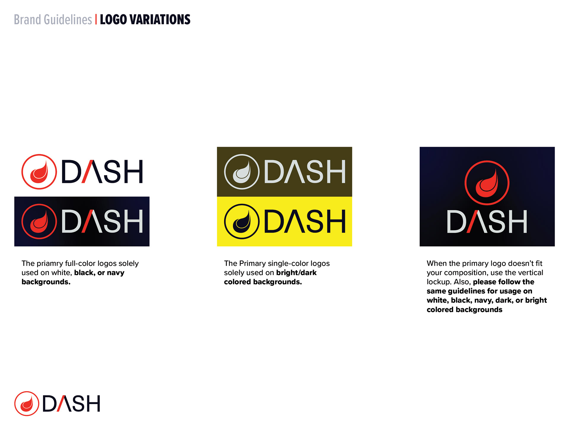
Logo variations

Logo usage
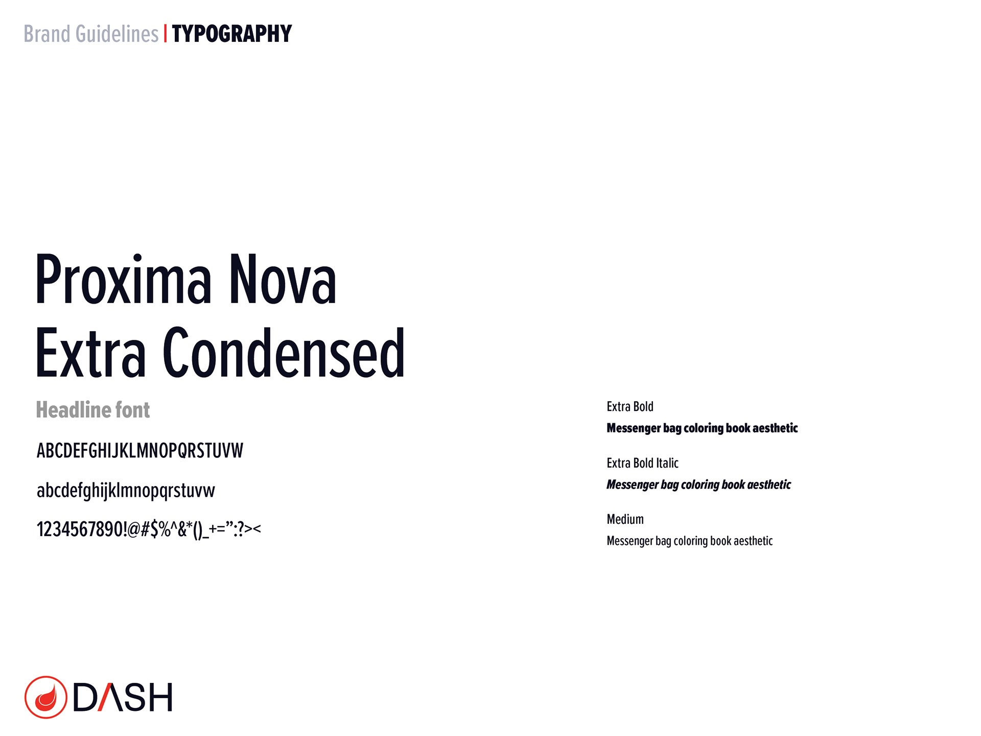
Typography: Headline font

Typography: Paragraph font

Color palette
Back page
The Quick Guide was well-received for its practicality, portability, and professional design. It has become an essential resource for the company.