Client: JetBlue (Terminal 5 Activation)
My Role: Graphic Designer
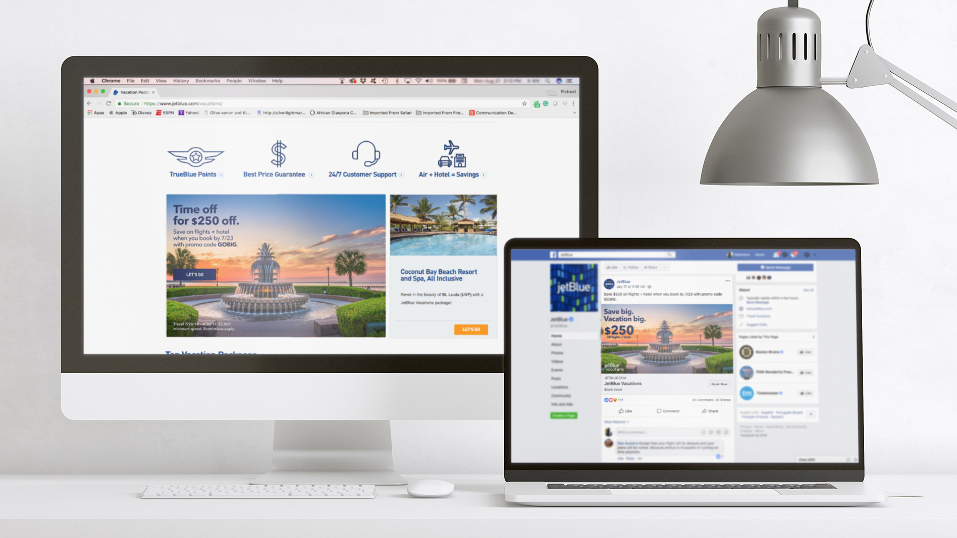
JetBlue wanted to bring music to Terminal 5 — I brought the vibe. This project was all about building a visual identity that felt fun, flexible, and unmistakably JetBlue — designed to live loud in an airport terminal and still travel well beyond it.
Challenge: How do you design a music-forward brand moment that feels fresh, fun, and unmistakably JetBlue?
Solution: Built a bold visual system for JetBlue Jams that could stand on its own — no artist imagery needed. I leaned into graphic patterns, clean typography, and a soundwave-inspired logo to bring energy to the space while staying true to JetBlue’s brand.
Everything was built to flex across print signage, digital assets, merch, and event materials — built to vibe in Terminal 5 and beyond.
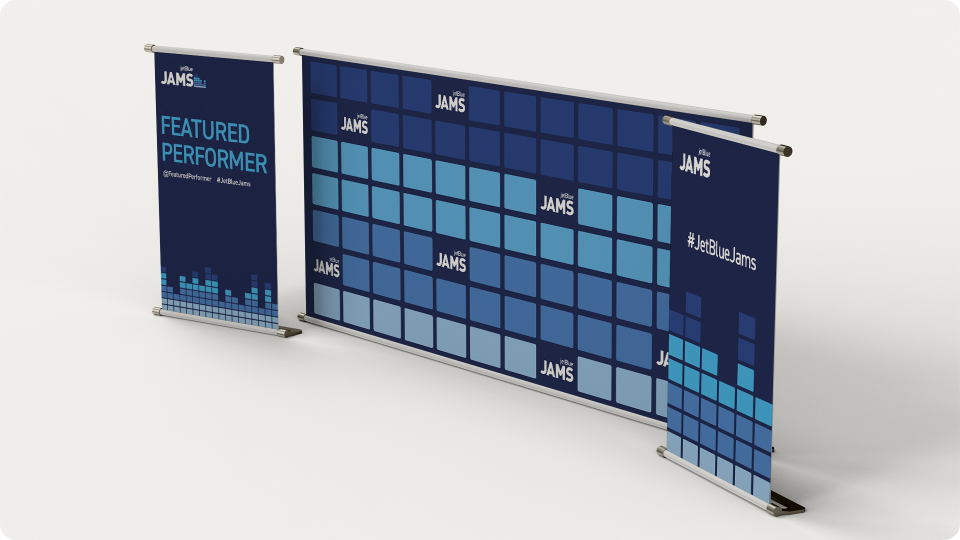
Visual System in Action:
This branding had to do two things: stand out in a busy terminal, but still feel elevated and intentional.
Graphic lockups, bold patterning, and large-scale signage brought energy without overwhelming the space.
Assets included:
• Logo Lockup
• Step & Repeat Backdrop
• Event Poster Template
• Custom Pattern Design
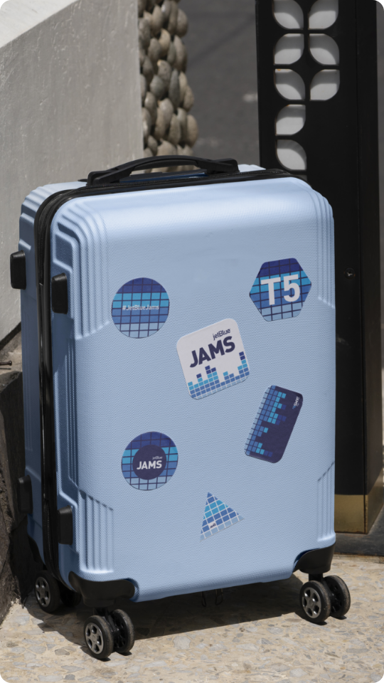
Brand Touchpoints:
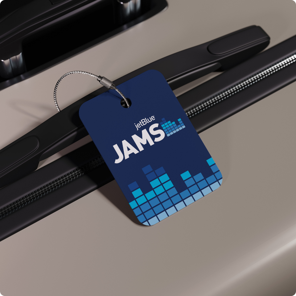
Merch made for travel. Stickers, luggage tags, and accessories gave travelers a little piece of JetBlue Jams to take with them, extending the experience beyond the terminal.
Results:
• Built a bold, travel-friendly brand system that stood out in a busy terminal
• Extended the experience beyond the terminal with merch and traveler-friendly touchpoints
• Delivered a vibe JetBlue could own — playful, memorable, and unmistakably on-brand
• Extended the experience beyond the terminal with merch and traveler-friendly touchpoints
• Delivered a vibe JetBlue could own — playful, memorable, and unmistakably on-brand
This wasn’t just event branding — it was a full experience designed to move with people, spark curiosity, and leave a lasting impression long after takeoff.