Client: JetBlue (EatUp Café)
My Role: Graphic Designer
JetBlue needed a label that did more than just sit on a container—they needed a brand moment at 35,000 feet. This was my first entry into packaging design, and I had to deliver function, form, and flavor all in one clean system.
Challenge: How do you design a label that’s secure, eye-catching, and on-brand—without overcomplicating the experience?
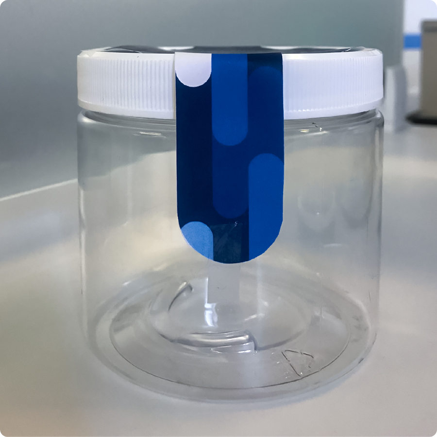
Solution: I designed a wraparound label system that doubled as a tamper-evident seal and a brand signature. Built for tight space constraints, the label left space for flexible uses (salads or parfaits) and integrated seamlessly with JetBlue’s in-flight experience.
I pulled from JetBlue’s pattern library and adjusted the color palette to feel refreshed, modern, and unmistakably JetBlue.
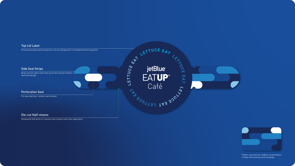
✏️ Design Breakdown:
• Top Lid Label: Primary branding element designed for instant recognition.
• Side Seal Strips: Wraparound safety seals that lock in freshness and reinforce the brand look.
• Perforation Seal: Enables easy opening and tamper-evident protection.
• Die-cut Half-moons: Fold points to maintain seal integrity and improve application.
• Pattern Source: Pulled from JetBlue’s brand library to maintain consistency.
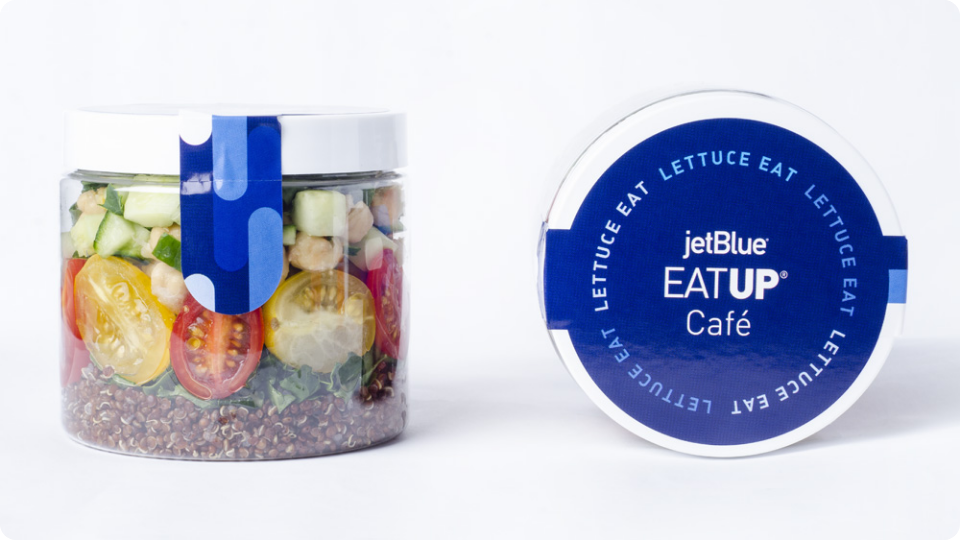
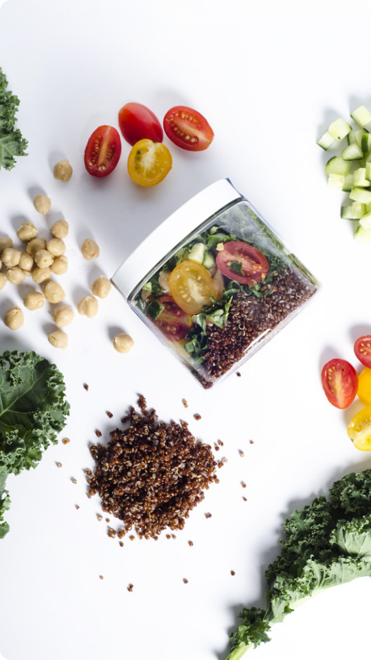
Packaging in Action:
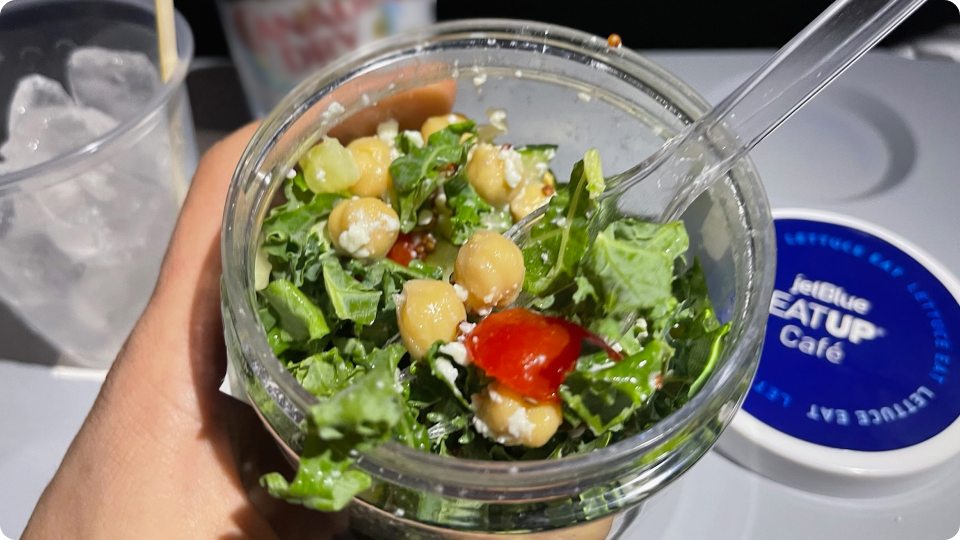
These photos capture the full lifecycle of the Salad Shaker label—from concept to customer. I started with in-house print tests to refine fit. The next two images, shot by Business Wire, showcase the polished product. The last image shows a real customer enjoying it mid-flight—a reminder that even the smallest detail can elevate the experience.
Packaging Wins:
• Turned a label into a branded safety feature
• Delivered a clean, elevated look that hit all brand notes
• Marked a personal milestone—my first packaging design project.
• Delivered a clean, elevated look that hit all brand notes
• Marked a personal milestone—my first packaging design project.
This wasn’t just a label—it was my first step into packaging design, where structure and storytelling came together as a brand experience.