Overview: The EatUp Cafe Salad Shaker project involved designing a multifunctional label that showcased the product and served as a safety seal. This project was a pivotal moment in my career as a graphic designer, marking my first foray into packaging design.
My Role: Under the art direction of Ciara Cordasco, I was responsible for designing the label’s overall concept and functionality.
Key contributions included:
• Conceptual Design: Developed the label’s dual-purpose functionality as both a safety seal and an
• informational element.
• informational element.
• Pattern and Color Choices: Sourced patterns from a provided library and selected color palettes that
• adhered to JetBlue’s brand guidelines.
• adhered to JetBlue’s brand guidelines.
• Packaging Integration: Ensured the label design complemented the product packaging and maintained a
• clean, cohesive aesthetic.
• clean, cohesive aesthetic.
Challenges & Solutions:
• Challenge: Creating a label that balances aesthetics with practicality.
• Solution: Designed a sleek, functional label that served as both a visual element and a safety feature.
• Solution: Designed a sleek, functional label that served as both a visual element and a safety feature.
• Challenge: Staying within brand guidelines while introducing creative elements.
• Solution: Leveraged JetBlue’s established branding while incorporating fresh patterns and color
• combinations to elevate the design.
• Solution: Leveraged JetBlue’s established branding while incorporating fresh patterns and color
• combinations to elevate the design.
Impact:
• Enhanced the product’s visual appeal while maintaining functionality and safety standards.
• Contributed to a cohesive in-flight dining experience through thoughtful design.
• Marked a personal milestone as my first packaging design project in my graphic design career.
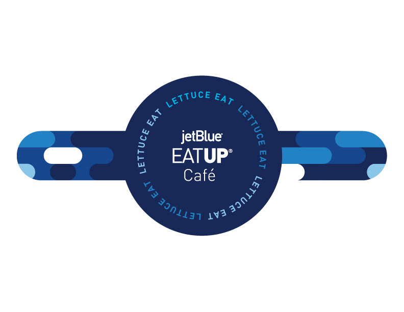


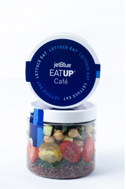

Feedback: The label was commended for its practicality, adherence to brand guidelines, and seamless integration of functional and aesthetic elements.
